Beyond the Spreadsheet
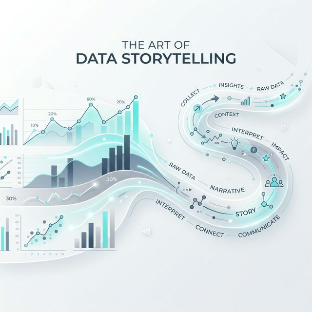
Data alone is silent. To drive change, you must give it a voice. Data Storytelling is the ability to communicate insights effectively through a combination of data, visuals, and narrative.
Why Narrative Matters
Humans have been hardwired for stories for thousands of years. When we hear a story, our brains release oxytocin, making us more likely to trust and remember the information. In a corporate or research environment, this means your findings are more likely to be acted upon.
The Three Pillars of Data Storytelling
| Pillar | Focus | Goal |
|---|---|---|
| Data | Accuracy & Depth | Build authority and trust. |
| Narrative | Flow & Context | Provide meaning and “The Why”. |
| Visuals | Clarity & Impact | Direct the viewer’s attention. |
Five Core Principles for Success
1. Understand Your Audience
Never present the same dashboard to a developer and a CEO. Tailor the jargon, the level of detail, and the final “ask” to the person sitting across from you.
2. The Narrative Arc
Structure your data findings like a story:
- The Setup: What was the status quo?
- The Conflict: Where did the data start to deviate? Point out the anomaly.
- The Resolution: What is the specific action required to fix it?
3. Eliminate the Clutter
Cognitive load is your enemy. Remove unnecessary gridlines, borders, and distracting colors. Every pixel on your screen should serve a purpose.
4. Use Strategic Color
Leverage Pre-attentive Attributes. Use color only to highlight what matters most. A single red bar in a sea of gray bars is a powerful storyteller; a rainbow bar chart is just noise.
5. Connect to Reality
Percentages are abstract. People are real. Instead of saying “System performance up by 15%”, say “This optimization returned 4 hours of productive time to every employee, every week.”
Ready to start?
Start small. Simplify one slide today and see the difference in your team's engagement.